Human Development Trends
So are we poorer or richer? Is income better distributed or not?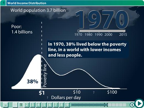
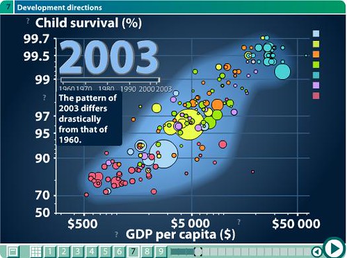
How about the health of the world?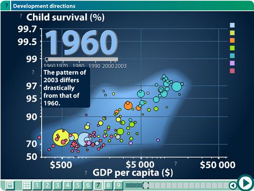
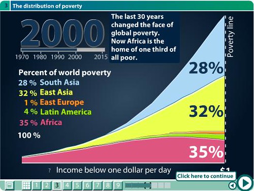
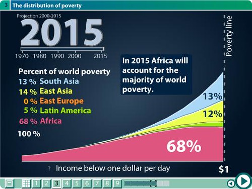
Who is staying behind?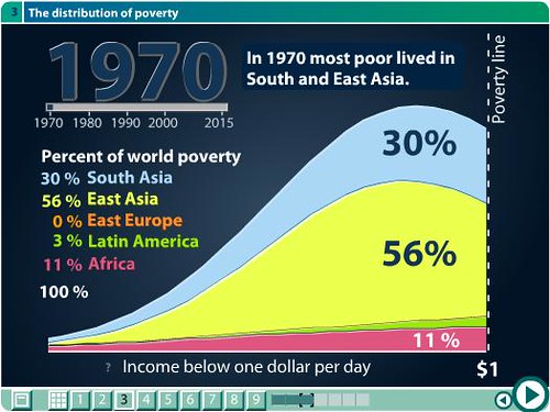
Sometimes pictures do speak for themselves. Courtesy of Gapminder.
"Being ignorant is not so much a shame, as being unwilling to learn." Benjamin Franklin
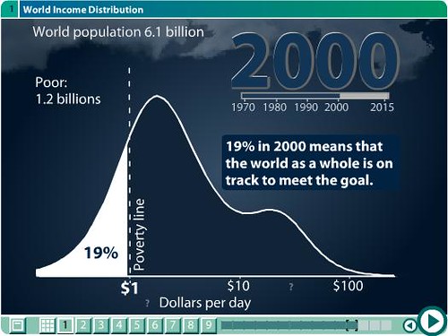
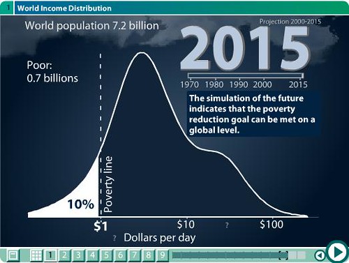
So are we poorer or richer? Is income better distributed or not?
How about the health of the world?
Who is staying behind?
Sometimes pictures do speak for themselves. Courtesy of Gapminder.
Posted by fyi at 12:19 AM
Labels: Globalization

2 comments:
Esses graficos sao muito legais. Eu ja havia os visto - em formato diferente - no curso de macro aqui no MBA...
Eu não acredito muito nesses gráficos.
Abaixo pode ler-se artigo em que se refere que existem estudos diferentes que chegam a conclusões diferentes.
Extrapolar numeros passados para uma situação futura ,por outro lado, parece-me arriscado.
Pode haver guerra..., depressão económica.., e a pobreza pode aumentar.
(sabe-se lá como estará o mundo daqui a 15 ou 20 anos...)
Finance & Development
A quarterly magazine of the IMF June 2002, Volume 39, Number 2
Is World Poverty Falling?
Angus Deaton
Real progress has been made in reducing poverty in recent years, particularly in India and China. However, there is still much uncertainty about the numbers. Using the same data, two reports released less than two years apart by the World Bank reached apparently different conclusions on whether world poverty was going up or down. How can we know whether the world poverty counts are accurate?
The first table of the World Bank's World Development Report 2000/2001: Attacking Poverty shows that the number of people living on less than $1 a day grew from 1.18 billion in 1987 to 1.20 billion in 1998—an increase of 20 million. Less than two years later, a headline chart in another major World Bank publication, Globalization, Growth, and Poverty: Building an Inclusive World Economy, showed that the number of people living in poverty fell by 200 million from 1980 to 1998 and showed no trace of an increase between 1987 and 1998. The poverty decrease was reaffirmed in the press release accompanying "The Role and Effectiveness of Development Assistance," a World Bank research paper issued before the March 2002 UN Financing for Development Conference in Monterrey, Mexico: "Over the past 20 years, the number of people living on less than $1 a day has fallen by 200 million, even as the world's population grew by 1.6 billion."
Can these statements be reconciled? Has there been a marked reduction in poverty in the last two years? Or has the Bank revised its interpretation of history?
Getting an accurate poverty count is important. The Bank sails under the banner "Our dream is a world free of poverty," which not only invites the use of the poverty count as a measure of the extent to which the dream is being fulfilled but also raises the issue of whether the organization's success can be convincingly measured by its own numbers. We also need an accurate poverty count to assess whether the international community is achieving one of the Millennium Development Goals endorsed by 189 countries at the September 2000 UN Millennium Summit—to "halve, between 1990 and 2015, the proportion of people whose income is less than one dollar a day." A lot depends on whether the scorecard is being credibly tallied, and the apparent discrepancies in the Bank's numbers deserve serious scrutiny. That scrutiny produces some genuinely good news about poverty declining but also raises some serious concerns about the numbers. With respect to the production of data, still greater transparency on the Bank's part is called for.
Poverty in India
Take the case of India. Its poverty counts are important not only because they have a large direct effect on world poverty counts—more than one-fourth of the world's poor live in India—but also because the world debate on globalization, poverty, and inequality has been echoed in an intense domestic debate.
India's economic liberalization in the early 1990s was followed by historically high rates of growth. But did this growth help or hurt the poor? Were their numbers reduced or did economic growth benefit only an increasingly wealthy urban elite?
The political debate has been fueled by questions about the accuracy of poverty measurements in light of the discrepancies between estimates of consumption growth based on national accounts statistics (NAS) and those based on household surveys carried out by the National Sample Survey (NSS). According to the NAS, real per capita consumption has been growing at about 3.2 percent a year since the reforms, while, at least until recently, the NSS data have shown little or no growth throughout the 1990s. Reform opponents resolutely quote the NSS data, while reform advocates back the NAS growth estimates, questioning the accuracy and the integrity of the NSS data and arguing that, because the poor's share of the national pie is more or less fixed, growth must reduce poverty.
The controversy only deepened last year with the release of the 1999-2000 consumption survey, the first major survey since 1993-94, when reforms had barely begun to take effect. In the intervening years, there had been a series of smaller ("thin") household surveys showing little or no growth in per capita consumption and, if anything, a rise in poverty. Accurate or not, they provided the only numbers in town and were widely used outside India—for example, in the World Bank's Attacking Poverty, albeit with due acknowledgment of uncertainty. Hence the belief that poverty in India had been increasing.
Unfortunately, in a decision whose timing could hardly have been worse, the NSS made major changes to the questionnaire design for the 1999-2000 survey. Although the new survey design is sensible in itself, it is not comparable with earlier designs and almost certainly leads to more consumption being reported, especially among the poor. As a result, measured poverty was lower than it would have been with the previous design. So when the Planning Commission issued its poverty estimates in February 2001, showing a dramatic fall in poverty—from 36 percent of the population to 26 percent—many cried foul. Pleas to have the survey redone to make it consistent with earlier surveys were ignored, and the ruling Bharatiya Janata Party was in no hurry to challenge estimates that showed rapid progress in dealing with India's most intractable and longstanding social and economic problem.
The chart shows the official estimates (the planning-commission head-count ratios) going back to 1973-74; each circle comes from a large consumption survey. The points labeled "thin" rounds show the (unofficially calculated) poverty estimates from recent smaller surveys. If the final point is blanked out, we can imagine the situation immediately prior to February 2001. From that perspective, the 1999-2000 estimate is nothing short of astonishing: the Indian poverty rate fell by 12.8 percent over 18 months, removing 60 million persons from poverty. Progress indeed!
Chart 2: Debt Laffer curve
Over the past year or so, I and others have been working with the data to try to sort out what happened. Although the questionnaire design was changed for most of the goods in the survey, data on an important group of expenditures were collected in the same way in all of the surveys. Fortunately, nearly all households purchase these goods, and the total amount they spend on them is a good predictor of whether a household is poor or not. The latest data show a marked increase in real expenditures on these goods, which indicates a substantial reduction in poverty overall. The extent of the increase also allows us to estimate how much poverty has fallen. Much to my surprise, most of the officially claimed reduction in poverty appears to be real. I estimate that poverty fell from 36 percent in 1993-94, not to 26 percent as in the official numbers, but to 28 percent. These calculations, although necessarily speculative, are supported by analysis carried out by K. Sundaram and Suresh Tendulkar at the Delhi School of Economics, who obtain very similar results using entirely different methods.
Another complication is the questionable quality of the Indian price indexes used to update the poverty lines. With some correction to the price indexes, as well as an allowance for the noncomparable survey design, the head-count ratio shows a fairly steady decline from 1987-88 through 1999-2000. Indeed, since the 1970s India has made more or less steady progress in reducing poverty. (The "fully adjusted" estimates in the figure also correct for overestimation of urban poverty in the official counts, and thus start from a lower base in 1987-88.) Even so, the estimates based on the "thin rounds" raise unanswered questions. Although the last of these, which is the most egregious, is relatively easy to challenge—if only because the survey ran for only six months—there is at present no obvious reason to dismiss the three earlier observations.
Can we conclude that the reforms helped reduce poverty? Neither consumption growth nor poverty reduction shows much sign of having been more rapid after the reforms. But neither is there any sign of general impoverishment as a result of the reforms—indeed, quite the reverse. What about inequality? Again, the change in survey design precludes any simple, uncontroversial answer. But the adjustment procedures applied to the poverty counts can also be used to estimate inequality, which has been increasing in recent years, particularly between states—the states in the south and west that were originally better off have grown most rapidly—as well as within urban areas, which have been the greatest beneficiaries of growth.
Because of this growing inequality, consumption by the poor did not rise as fast as average consumption, and poverty reduction was only about two-thirds of what it would have been had the distribution of consumption remained unchanged.
World poverty at the Bank
India's story was not available to the authors of Attacking Poverty, whose estimates of the decline in world poverty would have been less pessimistic if, instead of a 50 million increase in the number of poor from 1993-94 to 1998, they had used the current estimate of a 50 million decline up to 1999-2000. Because China has also made continuing progress in reducing poverty, it is possible to paint a rosier picture of the decline of world poverty today than it was one year ago. Indeed, according to recent calculations by Shaohua Chen and Martin Ravallion (2000) of the World Bank using all of the household survey data since around 1980, and with due recognition of the data's many inadequacies, the best current estimate is that there are indeed around 200 million fewer people living in poverty now than 20 years ago. So it seems that both Attacking Poverty and Globalization were right: poverty rose a little from 1987 to 1998 but fell substantially from 1980 to 1998.
Yet there remains much in this story to make one uneasy. Most obvious is the discomfort of having to rely on data whose margin of uncertainty is enough to allow, over a period of two years, such discordant views about what is happening to poverty in the world.
Attacking Poverty, whose preparation was much influenced by nongovernmental organizations and groups opposed to globalization, frequently takes a skeptical view of the role of economic growth in promoting poverty reduction. Globalization takes a much more sanguine view. A chart showing the number of people living on less than $1 a day from 1820 to 1998 shows a decline from about 1980 that accelerates in the latest years. The historical data in this chart were assembled by François Bourguignon and Christian Morrisson in a paper that is to appear in the American Economic Review. They derive their estimates by applying (sometimes sketchy and outdated) distributional information to the consumption figures from national accounts data, a technique that is almost certainly the only methodology that would allow the construction of data for a century and a half. But as we have seen from India's statistics, such methods can sometimes beg the question of whether growth reduces poverty. After 1993, when the Bourguignon and Morrisson data end, Globalization uses the poverty estimates that were assembled by Shaohua Chen and Martin Ravallion prior to Attacking Poverty. But Chen and Ravallion's data from 1987 to 1993, which is when poverty increased, are dropped from the chart. In consequence, and without any new information, we go from an assessment that the number of poor people in the world was showing little or no decline from 1987 to 1998 in Attacking Poverty to an assessment, in Globalization, of a continuous and accelerating decline from 1980 to 1998.
One of the Bank's greatest achievements over the past 20 years has been its extensive investment in primary data, particularly the household surveys on which the poverty counts are based. Before the late 1980s, the Bank calculated and forecast poverty from data on aggregate consumption, together with whatever distributional information might be available, sometimes from an earlier period or even from a different, but "similar," country. Since they were first calculated in 1987, the $1 a day poverty counts have been based on direct observations of what poor people earn or consume, using the several hundred income and consumption surveys that are now available to the Bank. This statistical advance is what makes it possible for us to have a serious debate about what is happening to poverty in the world. And it is clear that the Bank's best economists do the calculations to the highest standards, and there has never been any suggestion that the counts are anything other than what the data show. But as the case of Attacking versus Globalization shows, it is possible for these underlying data to be used in ways that seem to support very different factual statements about trends in world poverty.
Although external access has improved over time, most of the data used in the count are not available to independent researchers or to agencies outside the Bank. Nor, given the arrangements that the Bank makes with member countries, is it possible for the Bank to make all of the data available. So the Bank is effectively the only producer of world poverty counts. National governments around the world carefully separate and insulate the production of data from the policymakers who rely on them and are often judged by them. A similar arrangement would surely be wise for the world poverty counts, if only to protect those who create the statistics. Perhaps there should be an independent outside agency or auditor who either produces the numbers under a carefully specified contract or verifies their construction. Second best would be for the Bank to continue to calculate the numbers but to visibly insulate them from the internal policy debate and to institute a process of collection and production that is fully transparent to outside observers. The Bank's very success in producing these numbers, and in making them a central part of the policy debate, argues for an upgrading in the way they are produced and maintained. Otherwise, if its reports continue to contradict each other, the Bank risks losing the authority to monitor its own success, and no one will know whether or not the Millennium Development Goals are being achieved.
Post a Comment